Project Brief

Maestro Conference brings online conferences to a new level through Social Webinar, an application that capitalizes on their patented breakout group technology to create an interactive space for richer conversations at scale.

The Challenge

While the current presenter controls which are used to change what is presented to the audience are robust, they are “difficult to use” and “clunky.” Over the course of three weeks, we were tasked to design a better solution.

My Role

My role largely focused on developing UX Strategy and prototyping. I established a design direction by defining ease of use with minimum number of clicks to accomplish each task. After receiving feedback and further iterating on the design, I conducted usability tests with a paper prototype. This user focus approach laid the groundwork for our design insights. Throughout the process, I continued to question each design decision to ensure that all aspect of our designs have a well researched rationale behind them.

Solution

The presenter’s controls are at the forefront for quicker and easier preparation with fewer errors.

Better Control

  1. Help text located right where it is needed (instead of a list at the bottom).
  2. Preview windows to provide presenter with a visual confirmation that they have included the correct web address.
  3. Technical language replaced with easier to understand language to avoid confusion and errors.

Allows More Customization

  1. Allow presenter to utilize the visual nature of the application by including written questions and answers for participants to vote on.
  2. For select engagement activities, presenter can control location of content.

Clarity in Content

  1. Participants can read along with the question, instead of relying solely on hearing the question and possible answers.
  2. Answering questions occur right in the polling space (rather than using the raise hand 1-5 options). This reduces errors during polling and distinguishes the two functions (voting and asking a question).

Easy Navigation

Once we completed our finalized design we created a user flow of how the presenter would navigate through the application which would allow less clicks and an easier understanding of what they are doing in the application.

3
Team Members
17
Days to make
14
User Interviews
8
Employee Interviews

Results of Our Design Solution

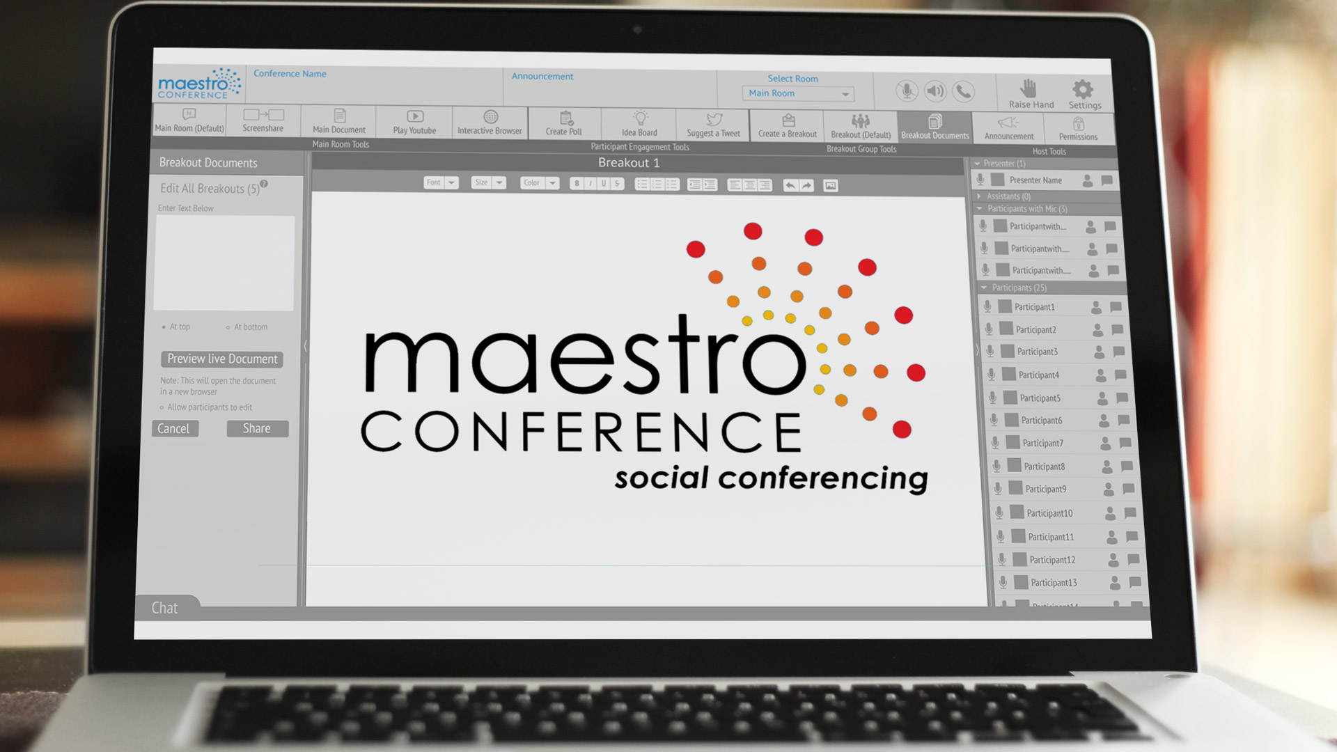
  • The Presenter can now prepare for their presentation on the left hand panel before pushing it out to participants
  • The Presenter can now preview the interactive browser and youtube video before shoing it to participants
  • We simplified the instructions and added question mark options when people need extra help
  • We used less technical verbage and made it easier to understand
  • The Participants are able to see who else is in the room including the host, presenter, and participants with mics
  • We fixed the hand raising confusion by getting rid of the hand going from one through 5 and had the options on the right hand side when the presenter pushes out a poll or idea board